Monday 31 January 2011

looks del.icio.us

combining graphic design with programming.


God knows what they mean. Some matey created a layout engine and a really efficient graphics library in python. And then apparently lost almost all of the code. "Computers suck", he says. He's right.

Narratives 2.0 - visualising music

Narratives 2.0 - Apache

Narratives 2.0 - Axel F

Narratives 2.0 - Galvanize

Visualising music. The music's segmented in single channels....lines move away from the centre point over time, and vary with frequency.

Wednesday 12 January 2011

ASHES57


a few wicked poster designs by ashes57. particularly the top two at least.

Sunday 9 January 2011

medicine research - energy tablets etc


PowerBar Performance Bar

Science in Sport Go Bar

Torq Bars With Ribose

High5 Energy Bar

ENERGY TABLETS - Suitable for men & women - Avoid fatigue & tiredness *FREE UK P&P* (60 pills)

A few designs of energy bars and tablets. Stuff to keep you going all day. The style of design appears absolutely unique to this type of product, I can't think of many other things that share similarities with them. Italic letter also appears to be favoured here, quite obviously because of their forward-moving stance.

Medicine research - NHS promotional material

NHSD04091 - CARD DISPENSERS

NHSD04099 - POSTCARDS-SYMBOLS

NHSD11081 - HOW TO COMPLAIN ABOUT NHS(EACH=1)

NHSD06092 - RESEARCH LEAFLETS

couple of functional but incredibly boring pieces of design. Makes me wonder why I chose Medicine as a subject.......the facts and the long words are interesting but the design is just not. But then again, it doesn't really need to be interesting, but it would be nice if it was just a slight bit captivating to look at. The balloon idea's cool but I don't really understand it.

Friday 7 January 2011

medicine research

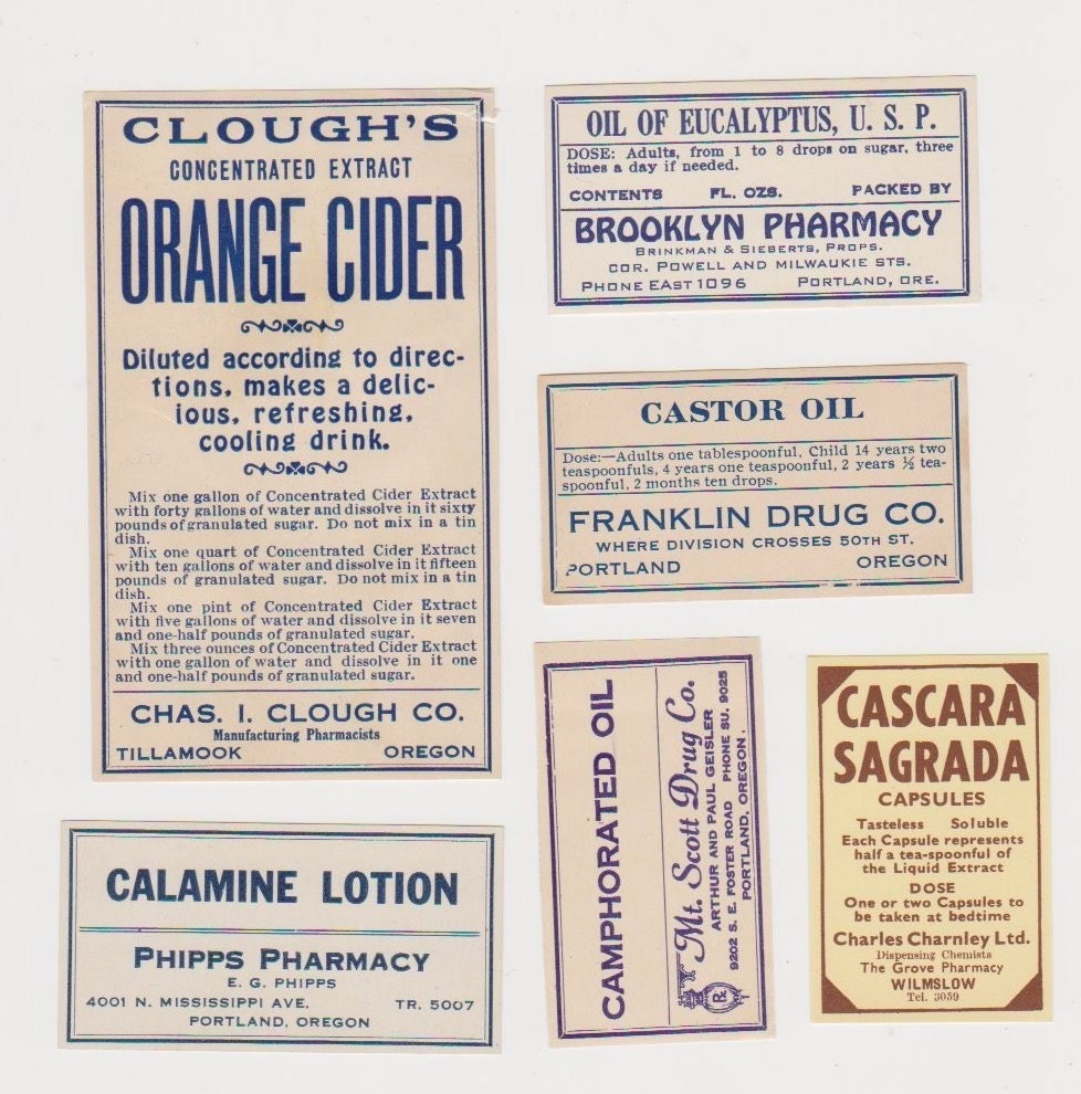
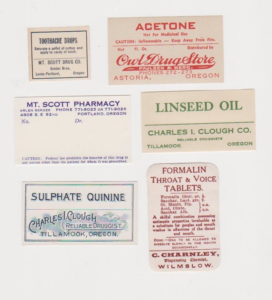
I suddenly remembered a book a mate had borrowed from the library, called 'art of the label' or something like that. I just remember it being full of proper old label designs for most products really, one of them which I'm sure was medicine packaging. Anyway, I can't get to the book right now, but I thought i'd look up some similar items on the internet.


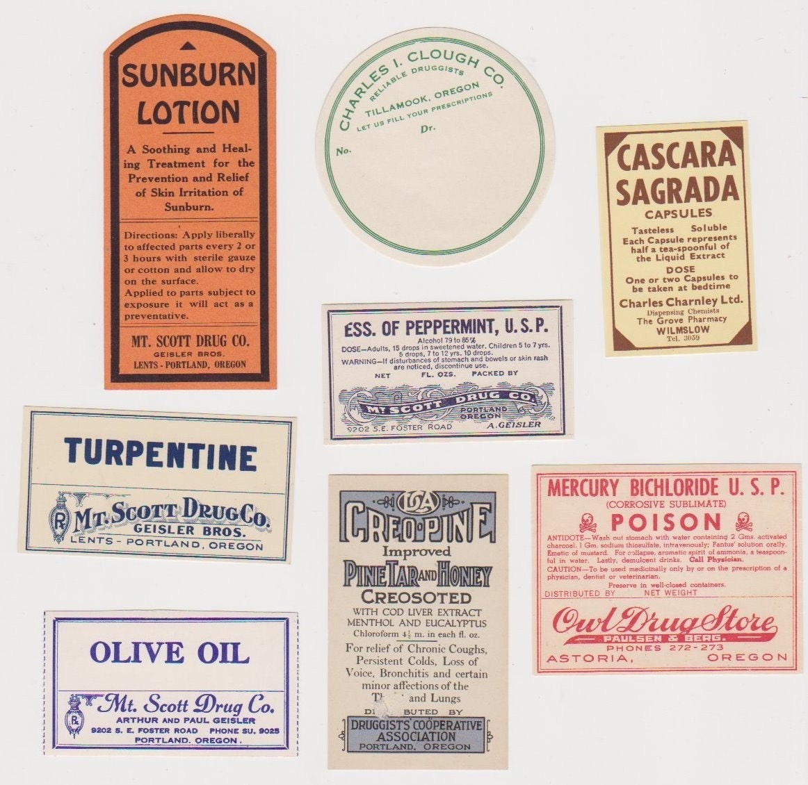
I found these images on www.etsy.com

I quite like them to be honest, if you found a bottle of medicine in these days with a label similar to one of these then I'm sure you'd be less than tempted to take it. They all seem less regulated and branded than modern medicines.

Thursday 6 January 2011

Design for screen - Give Up Art. again.

Back to one of my favourite design companies, who produced a series of short animations for a Japanese TV station. They won the pitch after going up against about 20 other companies worldwide, so respect to them i guess. They are pretty cool animations, intended to 'provide a small moment of calm in between the frenetic pace of the channel's regular output', which is exactly what they do. i just dragged some pictures over but i'll drop the link as well, as it's worth looking at a couple of the video samples they have on there.

http://www.giveupart.com/wowow.html


art on the underground

One Thing Leads to Another - Everything is Connected (Richard Long)

a cool bit of typography for some jubilee line art exhibition, designed by Richard Long. who is a fine artist. raises some interesting questions in my head.............

it really annoys me though that the grey coloured line is not actually continuous throughout the whole image, as it really seems like that was the intention. oh well. it's still quite nice anyway.