Wednesday 28 September 2011

Myths & Misconceptions about grid systems

http://www.aisleone.net/2009/design/myths-misconceptions-about-grid-systems/

A wicked little essay by Antonio Carusone, the guy that runs AisleOne. I thought it was pretty relevant to my research about the Golden Ratio/Rule of Thirds, it ties in quite well , along with my growing interest in grid systems and minimalism....either way its a good little essay that argues the point for making good use of grids pretty well.


Myths & Misconceptions About Grid Systems

November 30th, 2009

By: Antonio Carusone
Category: DesignGrid Systems
Comments: 90
 
A few myths and misconceptions about grids exist in the design community that can be detrimental, especially to designers who are new to the subject. I recently read an article, which is no longer online, claiming that grids have disadvantages and it listed the reasons why. As you can guess, I very much disagreed with the entire article and felt that it was providing a lot of bad information on grid systems. All of the listed “disadvantages” were distortions derived from the lack of understanding on how a grid works and functions.
In response to that article, here’s my attempt at clearing up this mess.
Grids are a design trend.
Grids have been in use long before graphic design became a discipline. During the 13th– and 14th-centuries, scribes used the Villard Diagram to organize their handwritten manuscripts. In the 15th-century, Gutenberg and others divided their pages using the Van de Graaf canon.
The use of a grid is not a trend, it’s a fundamental skill that designers should possess. Grids have been around a very long time and are an important part of the design process.
Grids can impede creativity.
Definitely the most ridiculous of the bunch, this myth suggests that a grid will cause a designer to be less creative. A grid should never define a design, it should work with it. To suggest that a grid can hinder creativity is the same as suggesting that a music tempo can as well. A grid is a building block that can never, and should never, impede creativity.
The legendary designer, Josef Müller-Brockmann, explained it well:
“The grid system is an aid, not a guarantee. It permits a number of possible uses and each designer can look for a solution appropriate to his personal style. But one must learn how to use the grid; it is an art that requires practice.”
Another outrageous claim is that grids are confining. When used properly, a grid will never limit or confine a design, it will grow and adapt to your liking. If someone tells you a grid gives you no freedom, that person doesn’t fully understand the purpose of a grid or how it should be used. Grids are flexible and allow for an infinite number of possibilities.
Graphic designer and writer Ellen Lupton explains:
“To say a grid is limiting is to say that language is limiting, or typography is limiting.”
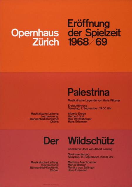
Where people get confused is with the notion that a design utilizing a grid should look “grid-like”, giving a clear indication of columns. Fortunately, that isn’t true, and this poster by Brockmann is a great example. The text clearly falls on a grid but the concentric shapes have more of an organic feel, making the grid invisible.
Grids only benefit certain designs.
A grid can be used for ALL designs. I’ll repeat that. A grid can be used for ALL designs.
To suggest that only certain designs can benefit from using a grid is to suggest that a structural foundation can only benefit a certain type of building or that grammar is only useful for a certain style of writing. A grid is a foundation, and like with any architectural structure, it’s a vital part of the process.
Grids also do not satisfy a specific aesthetic. They do not require the use of Helvetica or the omission of images. A grid can be applied to any style of design, no matter if it’s scrapbooky, or clean and minimal. You don’t have to design like Brockmann to use a grid.
Here are two sites that exhibit completely different styles of design, but both make use of a grid.
Example 1 is predominantly white, doesn’t feature many colors or textures and uses a sans-serif typeface.
Example 2 uses a larger variety of colors, textures and a serif typeface.
Grids require a lot of content.
The amount of content in no way dictates whether a grid is required or not. A design needs to visually communicate an idea or message, whether it’s a 250 page story, or a 5 word sentence and an image. A grid helps achieve that goal through structure, organization and hierarchy.
Grids slow down the design process.
The opposite is actually true. A well-designed grid, used by a competent designer, can help solve a design problem in less time. A fully designed grid system will also provide a consistent structure and organization across a multi-page design, like a web site, making the process more efficient.
Grids only work in a fixed layout.
This is specific to web design. Many people believe that a grid needs to be fixed and as a result can only generate a fixed layout.
Not true.
A grid can be designed to be fluid and change with the viewport size, scaling itself proportionately.
A few articles have been written on the subject and there are even a few CSS frameworks available:
Conclusion
Hopefully this article has helped clear up a few myths and misconceptions about grids, and has allowed you to better understand the purpose of them and how they should be used.
If you’re interested in learning more about grid systems, visit my site The Grid System for helpful links to articles, tools, books and templates. 
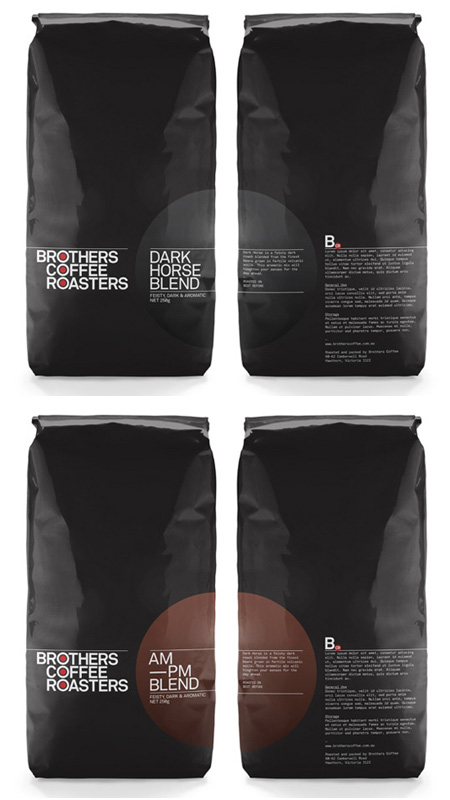
Brothers Coffee Roasters - Promotion/Packagaing

Quite a nice little find on AisleOne again, respect to that guy Antonio Carusone for finding all sorts of gems here and there. Anyway I just thought this was quite a neat bit of packaging, nothing too overboard if you see what I mean. I'm liking this sort of stuff at the moment.

Brothers Coffee Roasters

Tuesday 27 September 2011

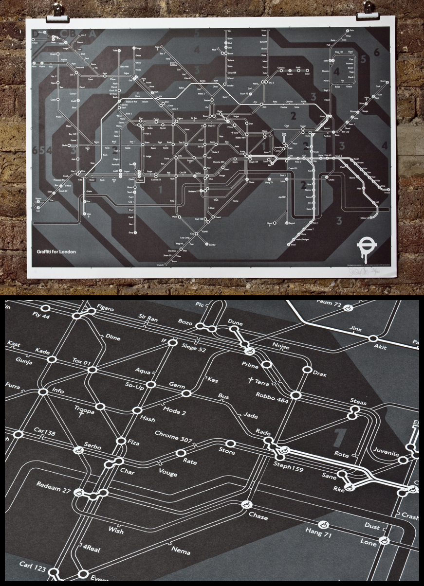
Writers Underground Map - Info/Wayfinding


A nice little take on the underground map, the close up shows it as quite a crisp print...I'm not sure exactly how it's printed, quite possibly just a nice inkjet job, I couldn't find any information on it really. Either way, it's fun to look at alterations of maps, especially when its specific to a particular subculture or whatever, or something that interests me quite a bit.

 https://blogger.googleusercontent.com/img/b/R29vZ2xl/AVvXsEiqSNuBdP9bZbOSUh7rsy2ozOI4CknqJ5Ols50KJPgLsPp1GGYMv2xm_tSKdXFCLHw4PlN_Besa8Y0i7MOe94bXao_kpJyIQcNZWIC3pJ_5c-izouGsPiyNTOs4dBOQM8dKXG741A35zB4I/s1600/Das+tube+map.jpg

Monday 26 September 2011

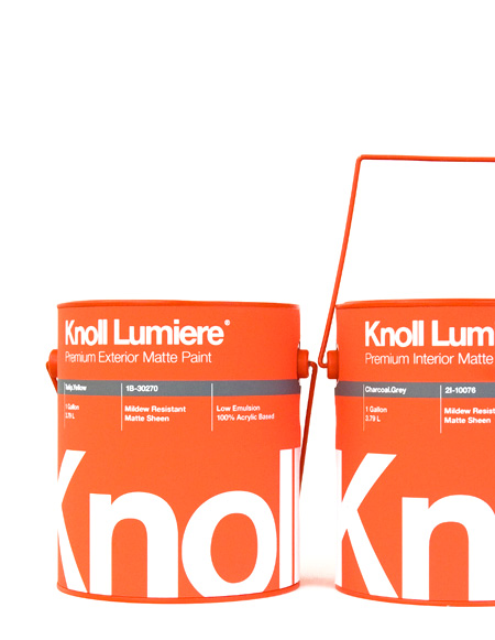
Knoll Architectural Paint - Packaging/promotion

Simply the best paint pot packaging I have ever seen. To be fair most paint pot packaging has never been visually striking enough for me to take much of a notice, I have to be honest.....but this is wicked, someone's taken great care with this one. After seeing this no doubt I'll take more notice in paint pot packaging, it's not something I ever really even thought about. It's the first paint pot that I'd happily buy just to keep on a shelf somewhere.

kristin-agnarsdottir-knoll-paint.jpg

F**k off back to Notting Hill - Publication

Another design by Donna Wearmouth, mentioned earlier a few posts back about some Quadra Gallery posters. I feel this is one of the most interesting, visually appealing, well designed and down-to-earth booklets I have seen in a long time....everything about it. It's very interesting to read; it contains some thoughts of a few residents of Hoxton..their opinions on how their community has recently changed, for the worse.

There's a digital version to read....well worth it.

http://issuu.com/donnawearmouth/docs/fucknottinghill_1

Magic two colour print....never fails..


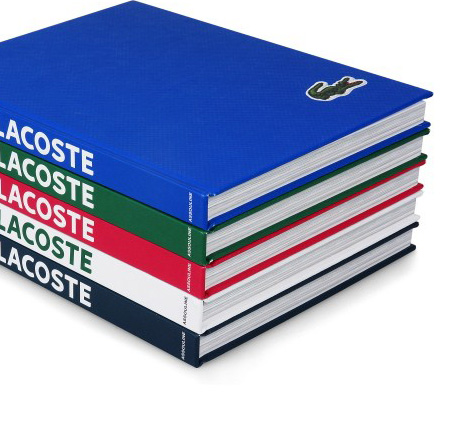
Lacoste: The Element of Style - Publishing

lacoste-the-element-of-style.jpg

I couldn't find a lot of information about this book (so it must be something special....) but I've been getting into Lacoste a little bit really, there's something really well thought out about their products, including this book... very clean, minimal, and fresh...I'm not sure if any particularly special printing/production methods went into creating this book, but the logo could quite well be embroidered onto the cover, much like on their other products.

Caravan Restaurant London - Branding/Identity

A nice bit of branding by InHouse, for Caravan in London. I'm particularly interested by the drinks range pictured further down, they look absolutely crisp, no fuss, no arrogance. I love it, apparently they're printed straight onto the bottle to look extra luxurious. I'm not so sure how you'd go about printing straight onto a bottle but it's a nice idea, and helps the company appear slightly more fresh and expensive.

caravan_7

Quadra Gallery posters - Promotion

Some incredibly nice posters by Donna Wearmouth;

http://www.donnawearmouth.co.uk/

She's got quite a sensible, minimalistic style (with the work I have seen so far) which I find makes for very attractive design. She made these posters for Quadra Gallery, which is at Southbank I think, but I'm not sure. Anyway, as far as these posters go, they hardly break any sort of boundaries in the design and print field but they're just simple and brilliant, I want some.


Just a very nice use of shape and type for posters. I'd like to see a physical version to be honest, I bet they look fresh.

F37 Bella Specimen - Publishing/Editorial (I think)

After stumbling across the Tent London directory design shown below, I thought I'd look up the typeface used, because I liked it a lot, and found this little specimen booklet showing off the typeface. It's really neat with a nifty bit of black foil blocking on the cover. Tasty.

F37 Bella specimen 1

F37 Bella specimen 2

F37 Bella specimen 3

F37 Bella specimen 5

F37 Bella specimen 6

F37 Bella specimen 8

Nice simple bit of print, straight to the point, shows off this typeface very reasonably. I might have to buy a copy, it's pretty cheap for the booklet, the actual typeface on the other hand weighs in at 35 quid so I'm gonna have to be alright for the time being.

Tent London show directory - Information and Wayfinding.

Accompanying directory for London Design Festival's Tent London show, a real nice piece by marc&anna. I don't think any particularly special printing methods have been used here, but the majority has been reduced to two or three colours, which is nice. What I particularly like is the typeface used (F37 Bella by Rick Banks...F37 Foundry); it's got that nice fat/thin thing going which I am a big fan of, very readable on a medium/large scale but still looks elegant and cool.

The salmon/pink stock is a nice idea also, bit softer on the eyes than straight up black and white.


I like this halftone image on the left also, works well with the stock used.


What is Design for print? Task 1.


TASK

Find at least 5 diverse examples of the effective/creative use of print in the following areas of design:
  • Branding and Identity
  • Packaging and Promotion
  • Publishing & Editorial
  • Information & Wayfinding
You should aim to identify design work from a range of commercial/cultural references, target audiences and creative contexts.

You will need to identify primary and secondary sources and not rely solely on web-based examples as this will encourage you to be more adventurous in your research and diverse in your findings. You will also gain a more informed understanding of the 'real world' context of the work.

Your findings should be recorded and critically evaluated on your Design Context blog.
Research Sources / Further Information

RESOURCE HANDOUT

Mandatory Requirements / Deliverables

A series of posts to your Design Context blog. demonstrating an in depth investigation into Design for print in relation to the 4 areas outlined above.

Significant critical evaluation of the examples identified through your research including informed reasons for their selection.

Thursday 22 September 2011

Studio Beige

studio beige olaf mooij


A proper nice example of the rule of thirds, I'm looking particularly at the second two images of the magazine layouts, but the first, front cover image is particularly nice as well. The spreads feel balanced and readable, there is plenty of space to let the graphic elements sit in their own position and not be interfered with by other elements. It's two-colour as well, which often makes for nice pieces of design. 

Opernhaus Zurich

Josef Brockmann Opernhaus Zurich

This rule of thirds in this poster are observed quite well, there is clearly some related thought gone into it....I quite like the colours personally, it's just a nice piece of Swiss design. The text doesn't follow the rule though....but then again...rules are there to be broken...sometimes. But actually in some ways it does....hmmm.

I am going to

research some pieces of art and design that make effective use of the Divine Proportion ( I mean really in most cases it'll be the rule of thirds, which is also relevant, just not as accurate ) as this will help me inform my current 'Good Is...' project. The pieces in most cases won't be made for the purpose of demonstrating the rule of thirds, like mine will be, but they will be good for developing ideas for my own work.

Thank you.