Monday 5 December 2011

North by Northwest

NORTH BY NORTHWEST/ Movie Title / Kinetic Type / from Henry Chang on Vimeo.


A kinetic type video for a movie title sequence/advert kind of thing. I'm enjoying the way parts of letterforms become frames for the next bit of text, quite a neat touch.

Sunday 4 December 2011

Mythbusters


Mythbusters Kinetic Type from Bryan Woods on Vimeo.

Fairly standard stuff in terms of aesthetics, though it is quite fun to watch. I've got to admit I am fairly bored of vector graphics these days but I suppose they do always work effectively, it's just a lot nicer to see something a little more unique and creative.

Breathless 1960


Breathless 1960, Typography from Emanuel Cohen on Vimeo.

Another quirky little piece of film, this one's quite short however. There's a bit of a shortage on the type front as there's quite a lot of image used as well, however I like it's rough, crafty nature and use of colour. Not really sure what it's about though because it's all in French. I'm also enjoying the way the odd random letter creeps in at various points, that's a nice little touch.

Pale Blue Dot

The Pale Blue Dot Typography from Nick Lyons on Vimeo.


Another nice piece, once again not simply just letters being pushed around a screen; this one has an interesting concept which is reflected well throughout the video.

War of the Worlds Kinetic Type


War of the Worlds Kinetic Typography from J.R. Schmidt on Vimeo.


Thought I'd start investigating some kinetic type to help me get involved with this project, I'm quite liking this one here, based on the old War Of the Worlds radio show. It's fairly gloomy and atmospheric compared to most kinetic type videos I've seen before, most videos seem to make use of the same pristine styling, clean cut with bright colours, so it's nice to see one that goes for quite an alternative feel, which of course is largely influenced by the audio clip used.

Monday 14 November 2011

International Office

A type specimen for Klim foundry, printed on newsprint as an alternative to previous Klim specimens, which are usually found in smaller booklets. I admire the simplicity of the design work, and the inevitable cost-effectiveness that results from this. Mainly however I looked at this for inspiration for my own type specimen-type-thing. It is interesting to learnt that these specimens don't necessarily need to be confined to small booklets. They have also taken inspiration from 'A Search For Tradition' - a talk by Douglas Lilburn in 1946 - in order to give some relevant content to the publication.


Monday 7 November 2011

Hague and Gill


Just fancied uploading this as I live just round the corner......pretty interesting how my town used to be kind of 'on the map' as such in the design industry....particularly with furniture design and manufacturing, and I suppose printing as well, as I have recently found out. 

Monday 31 October 2011

MFOC

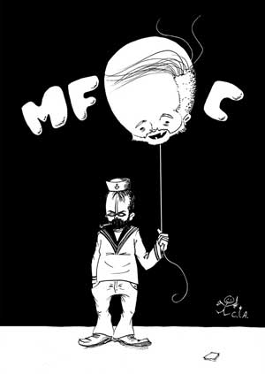
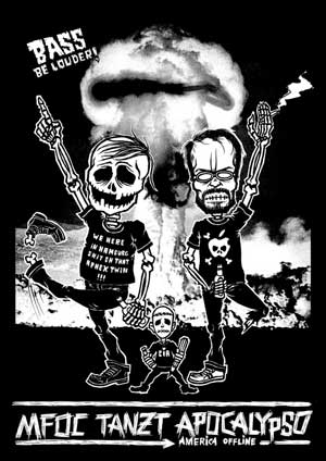
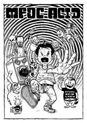
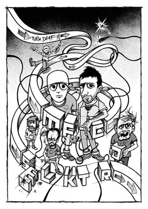
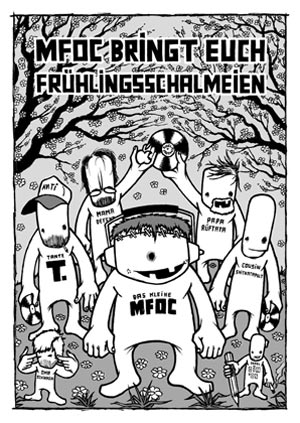
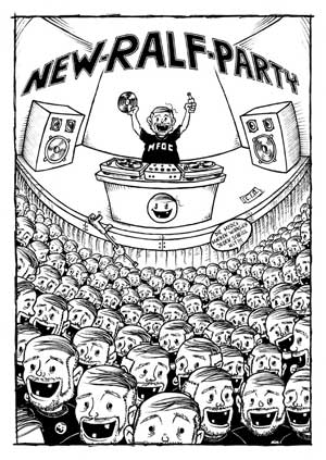
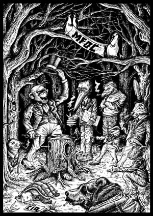
Until I learn German I'm not really sure of the ins and outs of what these posters are for or who they are by, I know they are promoting nights at a certain club in Hamburg; anyway I thought I'd put them up; they've got a wicked homegrown style to them which presumably reflects the club itself.

Cheap and cheerful, probably cost next to nothing to reproduce. I'm not sure how/if they are going to relate to the current project, but I like them a lot anyway.


Got to be by far some of the best material I have seen in a while. It's definitely related to my last post, it's for the same club, though I'm not sure if they're necessarily by the same person. This is where my lack of German language becomes a bit of a problem.

Saturday 29 October 2011

Hessle Audio

A wicked Hessle Audio poster I came across on Ben UFO's facebook page....its undoubtedly promoting a night or something, at least I think so. Either way, it's got a nice abstract/maybe slightly modernist approach going on here, it's hard to put a finger on it. Then again it's not modernist really because it doesn't quite conform to those stereotypical Modernist stylings such as grid systems and complete lack of ornament, which I suppose is pretty obvious as soon as you see the hand-drawn type. Looks like a pretty basic print to be honest, one colour on a pretty standard substrate...cheap and cheerful but very very nice, particularly if you know who it's representing.

I read that it's designed by Cialex, whoever he/she/they is/are. I tried going on the website but I couldn;t find my way past the first page which made me feel pretty stupid.

Friday 28 October 2011

Published By Process

Published by Process is a Melbourne based publisher of this quarterly journal named Process:

"Process is dedicated to capturing beautiful work in print, stepping back and allowing the design to do the talking. Published by Process proudly supports the Australian design industry and all publications are printed and produced to the highest possible standards on Australian supplied paper stock in Melbourne, Australia."


This makes it fairly relevant to what I am hoping to do; capture various ideas and examples of art/design kind of stuff that potentially makes use of the Golden Ratio. The way they've achieved this looks pretty incredible; very spacious, slightly minimal designs that give a lot of space for appreciation - which is how design should really be appreciated. They seem like a very focussed studio that take a great deal of care for the entire process, from planning to finishing. Neat.

About / Contact

PROCESS_ED05_COVERS

PROCESS_ED05_01

Process_07

IMG_4722

Schaffter Sahli

Jan_Fabre_2.jpg

A slightly quirky poster by Geneva-based studio Schaffter Sahli (click to enlarge). Looks like a two-colour screen print job, though I suppose it could be a number of different methods depending on quantity produced....I'm not sure if it is at all nice yet, and I'm sure I know a fair few people who would tell me why it isn't. It's however quite an adventurous idea to be honest; it seems to be an attempt to break away from typical Swiss design standards, which is also slightly apparent in some of their other work. It's interesting. I'm trying to think of something to relate it to......maybe like when you buy an Orange phone and bang an 02 sim card in there. It'll definitely be 02 but there's still a few Orange icons lurking around.

Pantone Matching System

Pantone Matching System. An internationally recognised system for matching colours, i.e. ensuring a document/design prints in exactly the colours that were asked for. Each colour comes with a reference number, explaining what number the colour is and what surface it has been applied to. (Coated/Uncoated etc...) The designer can supply a list of Pantone numbers that are to be used in the printing process, and the printer can then use these to set up the printer ink and ensure the correct colours are used. Very good for eliminating any sort of mistakes. 


And in a very dry design-humour sort of way people have applied this kind of thing to every day products. Making the sort of thing that you can't tell if the designer was trying to be slightly funny or slightly clever or something like that. 

Friday 21 October 2011

The OK review - issue 001

The Oklahoma Review - A publication of the Oklahoma State University English Department, which they've filled with poetry, fiction, non-fiction, and some visual arts, which are a bit of a treat.

After my Crit on Thursday it seems logical to heavily focus my research and design towards the Editorial/Publishing side of things, so I'm carrying on researching various publications, such as this one. From the off, this looks pretty edgy as such, a little bit rugged, which is quite refreshing to see, as most magazine designs often seem to abide by a clean-cut A4 format which looks pristine and a little mundane. It doesn't appear like they've overly tried to push the boundaries in terms of grid systems and layouts; instead, a simple grid has been used to maximise the image and type, allowing them to push these elements to the boundaries, and as a result, have created a unique feel for this publication.

Obviously in relation to my own current project this kind of alternative approach may not be quite suitable, but nonetheless, I would like to give my own publications an individual and unique aesthetic and feel to set it apart from others.


Tuesday 18 October 2011

a good quote

"Design is, in essence, communication, but the vehicle for communication is the design."


- Mark Boulton.


http://www.markboulton.co.uk/


Eh, it's not a bad quote. Kind of represents the circular nature of the process. Cool.

IL Magazine

I pretty much decided to focus my 'Good Is' project towards the whole publishing/editorial side of things, you know, magazines, journals etc. It seemed the most logical direction to head in, out of the four choices that we were given. 

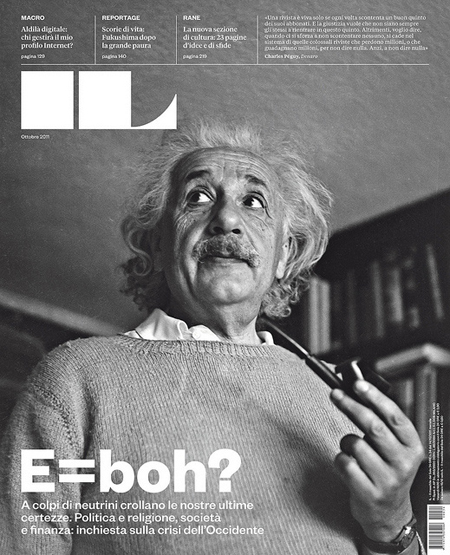
Anyway (again on AisleOne) I found this magazine cover by Francesco Franchi. He did all the layouts and the cover and stuff, a lot of the other elements, type, grid, logo etc were dropped by other designers. 

This front cover is pure magic

il-magazine.jpg

Apparently this is the grid he used to lay out the spreads. By Karl Gerstner. Obviously.


The grid boggles me, so here it is in action:


And this one; I'm really enjoying this one.


Monday 17 October 2011

Imposition

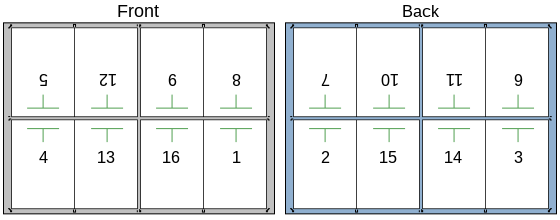
Commercially printed publications often make use of large sheets of paper that can be printed, cut and then folded before binding, like so:


These are cut down and folded to create a section of a publication.


Image above shows sheets ready to be cut and folded.


SUBSTRATES

A substrate is a stock or material that recieves a printed image. This can range from standard sheets of paper to more elaborate stocks, for example boards, t-shirts or coffee mugs amongst many things. 

The substrate used will be determined by its ability to 'take' a printed design, and this is of course dependent on the type of job, what is to be printed, and the ambitions of the designer. For example, a newspaper will use a different substrate to a published book.

A few paper types: 

Art Paper - paper that is coated in China Clay on both sides, quite often for full colour magazine covers.


Book Paper - As the name would suggest, the type of paper most commonly used in the publishing industry for novels, and often for the covers of hardbacks.


Cast Coated Paper - Paper with a high-gloss finish, used for high quality colour prints.

Splendorlux cast coated colors

Yellow Pages - Paper used for bulk productions, around 40gsm as to ensure high density of pages whilst being readable on both sides, typically used for classified directories or catalogues.


Newsprint - Standard material for newspapers, cheap to buy and readable on both sides.


These are obviously just a few out of countless different substrates, each of them serving a few particular purposes. Choosing one of these would take into consideration cost, effectiveness, and ambition.


UNUSUAL SUBSTRATES

There are a lot of alternative substrates that can be used for a wide variety of reasons, both practical or otherwise. For example, the signs we see everyday have been printed on to metal for durability and visibility, and starbucks mugs have their logo printed on the side in a promotional sense.


Basic print techniques - inks

A quick explanation a few types of printing; CMYK, monochrome/tints, and spot colours

CMYK:

Standard digital printing process, making use of Cyan, Magenta, Yellow and Black in a subtractive way to achieve average, limited prints.


A bit like that. Cheap and cheerful on a small scale production. Obviously these dots have been made unreasonably large just as a demonstration, but it shows how it works. The shutterstock thing is not part of it, that's the watermark from that website that people go to when they are too lazy to go and get/make their own images.

MONOCHROME/TINTS:


'Monochromatic light' refers to light of a narrow frequency. The same sort of thing applies in printing, or even painting and whatever else. It's basically printing using one colour, and tints of this colour, if you see what I mean. There's a good example of this on Tim Wan's work below.

SPOT COLOURS:


Any colour generated by a single ink, pure or mixed. There are various advantages to this process, in terms of cost and the ability to obtain special colours unachieavable in standard printing processes, such as CMYK.

The image above shows a printer that has two stations delivering a particular colour at a rapid rate.

Love Twenty Two


Hello Couture/Love 22/Ryan Atkinson

Quite a nice series of posters combining fashion, design and typography. The printing process behind it at the moment remains a mystery to me so it is something I will have to find out at some point, no doubt it is something glaringly obvious, I mean it might well just be CMYK but the colour pallette seems fairly limited, suggesting to me that it might be a three-colour job, or maybe it's made up a few special inks to give it that vintage look. Couldn't really find any details on the internet.