I'm quite enjoying this work for a festival in Brazil, it is very light and informal....a good mix of hand -rendered stuff with a little bit of proper type....very festival-ish
Book by Mark Z. Danielewski...typographically challenging novel, breaks the traditions of conventional book design, although I haven't read the book so I don't know how effective it is as a piece of work but I imagine it must have some kind of impact on the resulting read. Either way it looks fairly interesting, I might try and get hold of a copy at some point.
A sweet idea for business cards - a bunch of blank cards were placed on the wall of the exhibition, which the artist did a painting over during the course of the exhibition. The guests could then take one of these business cards as their own personal souvenir from the exhibition.
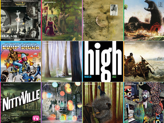
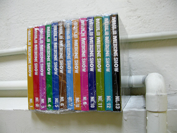
Madlib Medicine Show - The Brick...each Medicine Show has a different cover, all quirky and out there, little bit edgy, like the music he makes. I'm not sure who's done the artwork but they're all just different as such. I like the guy and the sheer amount of music he makes. I'd love to be able to make as music as he does.
Haven't got round to doing much design context stuff recently...too many beats to make...but here we are; as usual after not doing anything much design related for a while I tend to flick around on various record label websites to see if there's anything visually decent floating about. I scrolled through a few bookmarks and remembered the 4AD website I had visited before. I only like a few bits and pieces that the label actually releases, but the website in itself is so fresh to look at; everything is written in fairly soft, un-assuming typefaces and placed near lines or in boxes which in my opinions certainly serves to tidy things up a bit.