A few posters by JG Wilkes, one of the founders of the Optimo night in Glasgow. Quite impressively, he's made the majority of posters for the weekly nights that have been running for 12 and a half years now, which is quite a lot of posters. The night itself seems to have quite a rich and vibrant history, but I believe that it has come to an end/will be ending very soon which is a shame, I would like to have experienced it myself. 12 and a half years is a good long run though. I couldn't find many of the posters, but the ones I could find are pretty quirky and cool.
Monday, 19 March 2012
Sunday, 18 March 2012
Student Websites
I thought I'd look at a few student websites, as well as some student areas in other newspapers, in order to get an idea of how they function and operate, in visual terms as well as content-wise. Hopefully this will give me a fairly good idea of what works and what doesn't, as well as potential ways of creating a student forum that is a cut above the others.
The first two images show The Independent's current student area, which is pretty straight down the middle, not a lot to set it apart from other student webpages/the rest of the website, which personally I feel is a little uninspiring, but I suppose it works at least.
The Guardian's student area has a slightly more visually pleasing layout to it, a bit more space and structure, which I quite like. There still appears to be a lack of inclusiveness to it though (on first impressions), in terms of student commentary.
A few other student sites, not related to newspapers. I'm quite liking thestudentroom.com, it has quite an interactive feel which could translate quite well to the forum we are proposing.
Labels:
i research,
OUGD203
Friday, 16 March 2012
Newspaper Vendor Examples


A few examples of newspaper vending machines, commonly seen around USA and other places that aren't England. I certainly have never see one myself, which is in a way not so much of a surprise as compared to other places I've been to I often feel that the UK is kind of beginning to get stuck in the past in some areas, or maybe I don't know what I am talking about.
Anyway I thought I'd take a look at a few. Maybe newspaper vending machines are also becoming a bit dated, but then again we can say that about the newspaper as a medium in general. However, very few students can afford an iPad to read the news on, so 20p for a newspaper out of a vending machine seems like a good shout. i'd probably buy one, just for the fun of taking one out of a vending machine. It kind of brings a physical experience to the act of reading the news, which would potentially set it apart from reading news on facebook, being stuck staring at a screen for 20 mins.
Labels:
i research,
OUGD203
Wednesday, 14 March 2012
Guardian Advert
This is the Guardian's latest TV commercial, I thought I'd put it up as I suppose it relates quite well to our YCN project. It appears as though they've got it spot on, the 2 minute commercial demonstrates how the paper stays on top of situations and relays un-biased news as soon as it happens kind of thing. They've pretty much smashed it. Across all formats as well. It demonstrates some kind of continuity, as in it portrays the Guardian as a living, breathing, multi-media news service, that can be accessed anytime and allow anyone to join the debate.
This isn't exactly re-assuring for me considering the brief that we are taking on; somehow now it seems as though we kind of have to come up with some equally flashy and slick for the i newspaper.
This kind of presents us with a number of options; we could either propose something equally as slick, although this would not be massively suitable for our target audience (students) who are less likely to take things so deadly seriously I reckon; or we could attempt to come up with a fairly different approach that would be hit more on a level with Average Joe student.
Different horses for different courses....
Labels:
i research,
OUGD203
Monday, 12 March 2012
show us your type posters - Melbourne
I've looked at this website a few times before and have been waiting for a while for the next batch of posters to show up, this time they're for Melbourne. I quite like the unconventional nature of some of them, particularly the fourth one, although this could well be my Monday-morning attitude doing some of the thinking for me.
I think I might enter the next one, perhaps as a Sunday project. The next city is Moscow, and of course I've never been there but hopefully that won't massively affect my chances.

Labels:
OUGD203
Thursday, 8 March 2012
letter heads
After our most recent type session, which partially involved making a letterhead, I coincidentally came across these retro letterheads for various people/companies at this website: http://www.retronaut.co/2012/03/famous-letterheads-1900-1997/
I'm quite enjoying the Marilyn Monroe one, and of course the Muppet Show Fanclub one.....haha
Labels:
OUGD203
Tuesday, 6 March 2012
Monday, 5 March 2012
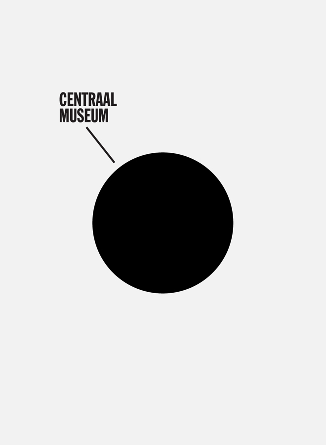
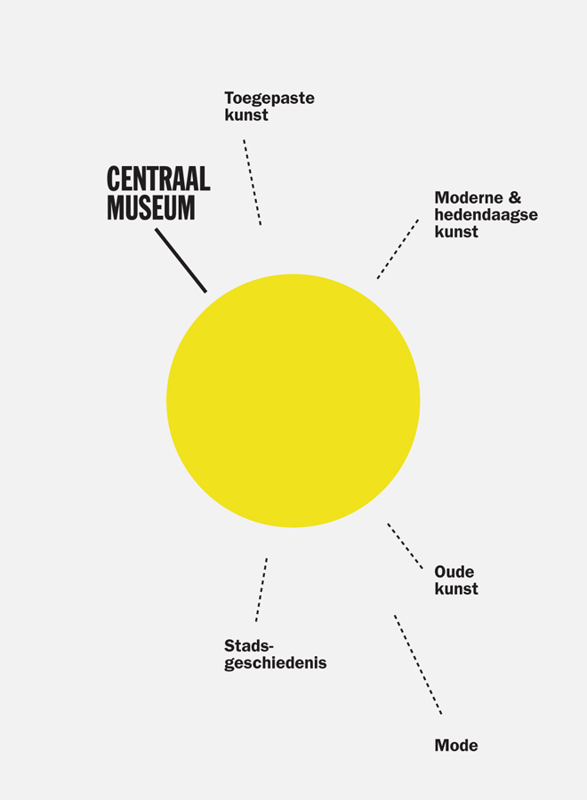
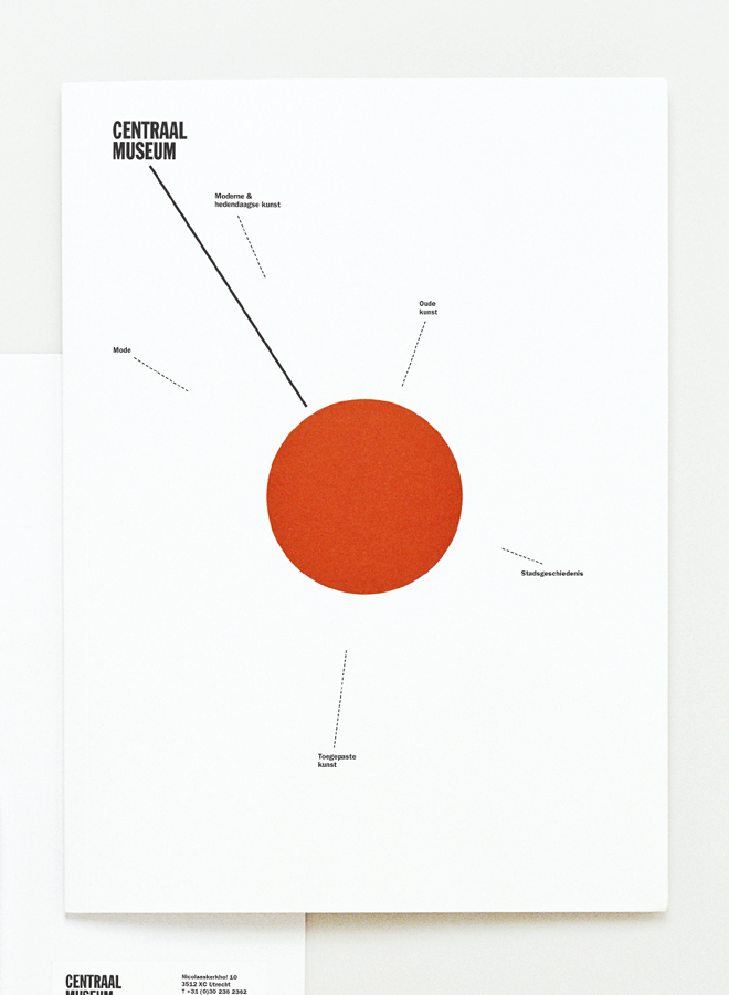
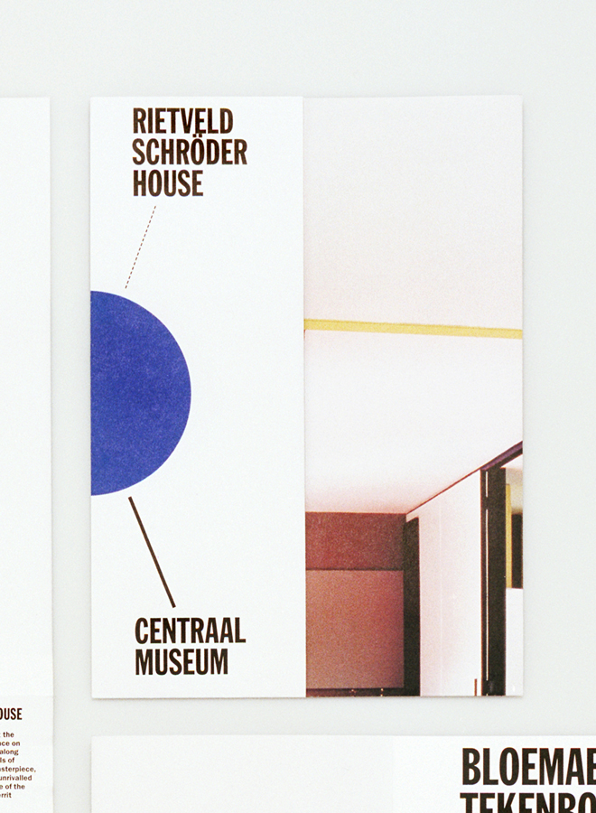
Lesley Moore - Centraal Museum branding
Some cool infographic-style work by Lesley Moore studio for the Centraal Museum in Amsterdam. I don't understand it of course but I am enjoying everything else about it, but I suppose in order to fully appreciate it I would actually have to pay a trip to the museum itself to see it in its proper context.


Labels:
OUGD203
Subscribe to:
Posts (Atom)


